Buying a poster from your favourite movies, band, singer, artist or even something your friend created, deserves to be framed and displayed. But you shouldn’t do this in any type of frame. This special item deserves a worthy display box where it’ll shine in all of its glory. Buying the right frame will enhance its beauty and elevate the room’s aesthetics.
Take the Right Measurements
The size of the frame is the most important consideration. It doesn’t matter if the store has the frame in the colour you want if it doesn’t match the size of the poster. There are three main sizes of frames, mini, maxi and alternative sizes. Mini posters are small and elegant. Their most common dimension is 40x50cm.
When placed on the wall they take up just a small portion of it. This is a great option if you have several different posters waiting to be framed. It’s also good if you don’t want it to take over the space. Maxi frames are very popular. They’re the most common choice because of the size of the posters manufacturers sell.
Their dimension is 61x90cm. Depending on the store and the manufacturer this size can vary a few centimetres. Keep in mind that a poster of this size can take up a lot of wall space. Alternative sizes are non-standard. They can vary in dimensions and are commonly used for framing things other than posters such as certificates, vinyl covers or prints.
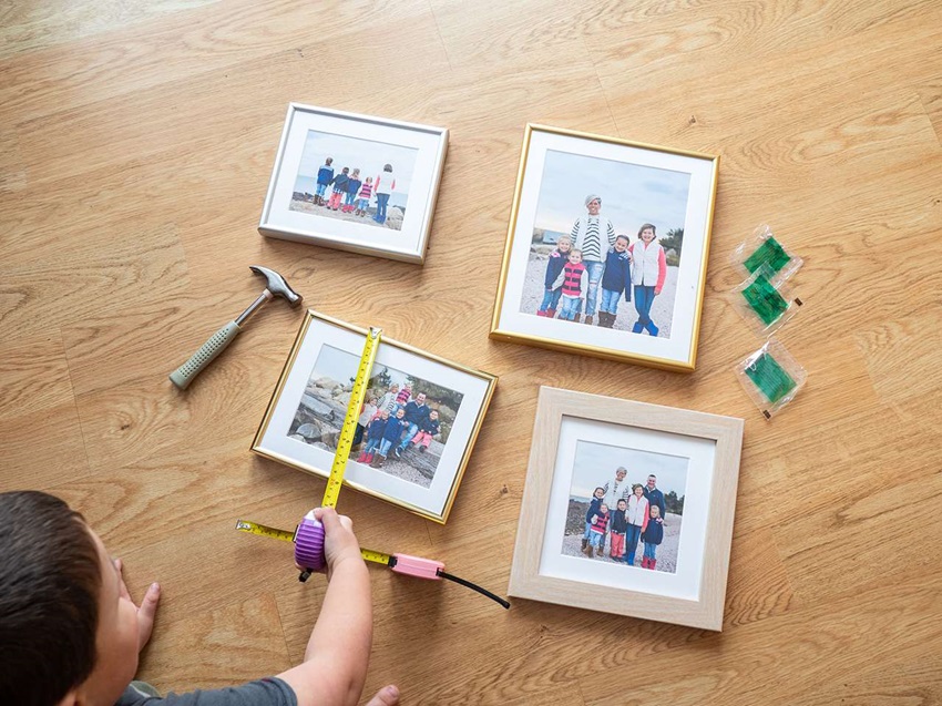
Before you buy poster picture frames for your art, make sure you measure the poster correctly. Don’t just guess the size. Keep in mind that the frame should be a bit larger than the poster. This way it won’t obscure the poster and its beauty. It’ll allow it to shine through and everyone can appreciate it.
Shape is Important
The majority of posters are rectangular. Most are designed to be displayed in a portrait position. However, they can also hold a landscape position. When you’re looking for the frame, specify the positioning because the hanging mechanism on the back can differ. There are also panoramic frames that are suitable for panoramic prints which are quite wider than the normal ones.
Take note of the shapes on the image you’re hanging. There are frames that can complement those shapes. If the poster has a lot of round figures, look for a frame with rounded edges. Paying attention to this can accentuate the poster’s beauty even more. If you don’t like everything to be rounded create a contrast and go for sharp edges.
Materials Matter
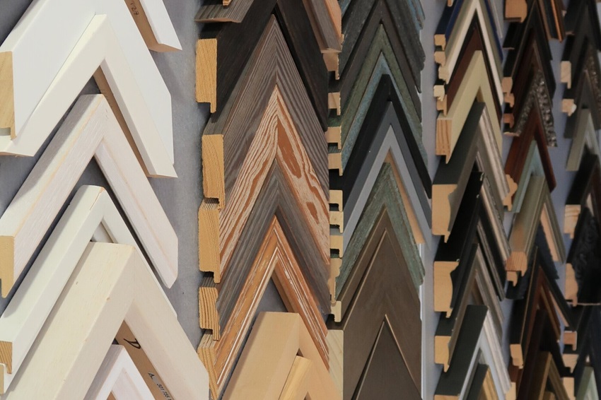
Picking the right material can make a big difference. In most cases the frame will be made of one, or a combination of two materials. The most common ones are wood, metal, acrylic and clear plastic. Some are cheaper than others, but they all have their advantages and disadvantages.
Most posters will look good in any type of frame. They won’t appear damaged or out of place. However, some of them look better when paired with certain materials. In general, big posters look good in acrylic frames, and small ones are fitter better for wooden frames. If you’re not sure which one to get, try them and see how they look before buying.
How About Colours?
Black
Black frames complement almost any wall colour and are quite versatile. They can hold any type of poster and even photographs, paintings and other artwork pieces. A black frame has the power to stand out and make an impression, especially if you’re using a mat board. Because of its neutrality, it won’t overwhelm the poster itself, only complement it.
This means you can hang it on every wall colour. The balanced tone it brings will match white, neutral and bright-coloured walls. You can use it for any home interior design, traditional, vintage, modern, contemporary, or industrial. It’ll give both the poster and the house an elegant hint.
White
White is a neutral tint, which makes white poster picture frames quite adaptable as well. It complements a variety of interior decor varieties and patterns without taking the focus away from what’s inside. By combining it with a white mat underneath, all the colours of the poster will pop out and show off.
It even works well with dark-coloured posters like black, grey and navy blue. It creates a good, calming display for any room in the house, bedroom, living room, bathroom, hall and even the kitchen. It also looks good in offices, creative studios, galleries and, surprisingly, hospitals and medical surroundings. Just make sure you avoid any matte mat underneath.
Wood
Wood is among the favourites. It’s very popular and can vary in colour from extremely light to deep dark tones. One of the most common choices is oak. Because it’s a natural material it gives the space a classic and vintage vibe. It also brings warmth and complements any type of furniture and decor.
If you’re framing a scenery poster wood is a great choice. It’ll accentuate and complement pictures of seas, oceans, forests and beaches. If you have oak furniture, go for an oak frame. You can do the same with teak, walnut or maple. The only time you should avoid wood is if your home is contemporary. It might not fit the space properly.
Silver
Silver frames for posters exude a chic, contemporary style. The glossy sheen does a great job of “lifting” the colours of an image to make it seem more striking and livelier. This is a colour that matches perfectly with modern and contemporary homes that give off stylish vibes.
They give the poster a wow factor and make them stand out. Even the plainest of posters can become impressive and eye-catching. If the theme is futuristic or technology-based silver will work well. Also, if the poster is darker, silver will make it look classy.
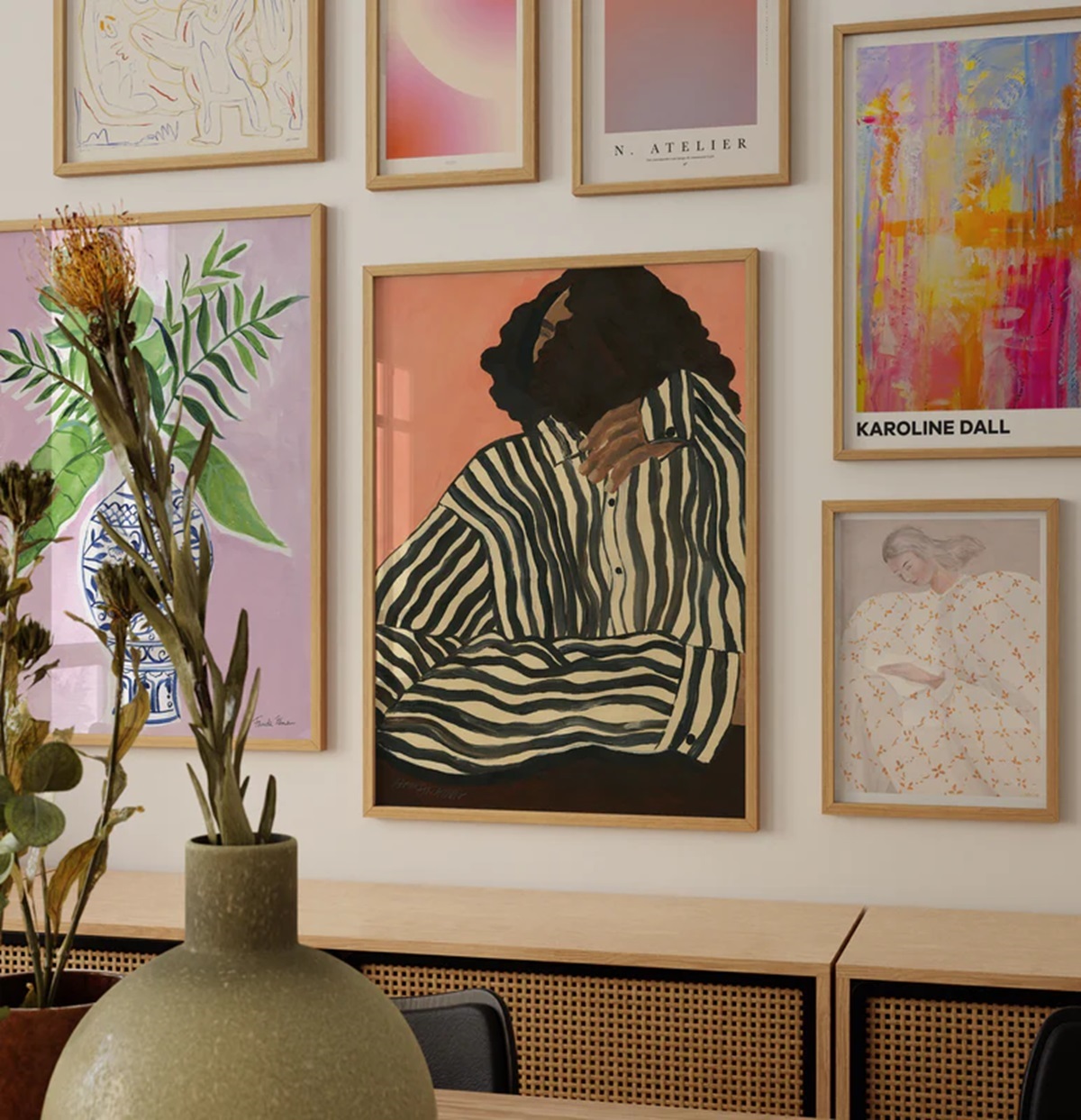
Matching the Room
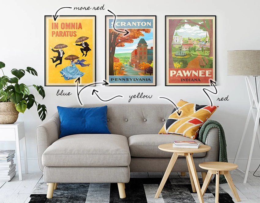
Matching the poster and its frame to the interior design of the room can make a big difference. If you have a monochromatic or neutral colour palette in the space, you can either match the frame to create a cohesive look or create a contrast with a bright colour.
This depends on whether you want the poster to stand out or blend in. If the room is filled with bright colours, you can choose a frame that tones down the vibe, or join in on the palette and blend in perfectly. Either way, your poster will look amazing in the right frame.

Leave a comment